Monday, 30 April 2012

Month One Complete!

It seems just like yesterday that I started this challenge.  In the last month I've likely spent more time drawing than the rest of my life combined.  I tried to do at least 20min a day, though my average was closer to 40, and some days I went for several hours.  I think this calls for a celebration!  First, let's see if we can find any improvement:


Here we have my beloved cat Joey again. On the right, my first sketch some 20days ago. On the left, a sketch I completed about 20sec ago. Improvement? Yes and no. I'd say the overall fur is much better, but that's mostly because of the switch to pencil. The face on the whole is better, I think, but still could use a lot of work. The tail (Joey wraps it behind his front legs, and you can see it just sticking out on his left side) is much better. The overall body shape is a wash. I'm less happy with the legs. I think I can accurately label it 'not bad.'

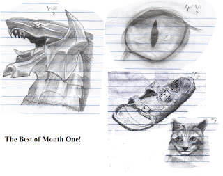
Anyway, time to celebrate! I drew something everyday for a month! I even had some fun doing it. I should go wild and treat myself to something. Maybe some sourdough pretzels. Anyway, here are my best creations this month, making a sort of Hall of Fame:


Interesting, three of these images were drawn from online tutorials. It's almost like having someone show you the way makes things easier or something... In 30 days I drew 4 images I really liked. That's better than 10%; by year end, I could have 40+ drawings in my Hall of Fame. Here's hoping. One month down, eleven more to go!

Saturday, 28 April 2012

Week Four: Faces Suck


I spent the entire week drawing the exact same face. Unfortunately, none of my drawings look alike. Face suck. Let me show you:

I have to turn the contrast up so we can see the scan properly, and that causes some residual background dust and the stuff on the opposite side to appear. Fortunately, all of these faces suck so it's not like it wrecked anything.

Each face is the identical boy. At least, it's the identical boy model in the book Amazing Faces. I would like to upload said face, but I worry that would be subject to copyright. It doesn't really matter: no non-demonoid looks like anything here. I think the nose is my new least favourite bodypart.

Something that should concern me is the lack of improvement. You can't really say that any one face is significantly better than any other; I think the very first attempt may be the best overall. I never got the basic shape right either. I blame the book here, as it says, “Draw an oval,” yet her final version of the face has been altered to allow for cheeks and the chin. The last few days I tried to free-draw the basic head shape, with fairly unpromising results. Note also that the hair is supposed to be a buzzcut, very short, but I generally make it look like an afro.

I can take away two happy notes, though: one, I won't be drawing a face again for a long time. That thrills me. Two, my final picture actually shows a good pair of ears. That's good; ears used to give me fits. These ones here have just enough suggestive shading to make it lifelike. One positive to take away from a rather agonizing week.


I now know why the manga/anime style of drawing cartoons is so popular: it makes faces very simple (noses are often just triangles; good idea!). In a couple of weeks I'll come back and try some more faces, but for now I kinda hope I never see another face again. Oh well, I can only improve, right?

Saturday, 21 April 2012

Week Three: The Value of Tutorials

Another week, another week of improvement.  Let's get right down to it.

The first four images are again from Draw 50 Animals.  All four have varying degrees of success.  All three images with legs, I'm not happy with the legs.  They are thin and, well, look wrong, lacking the muscular power a big cat should have.  The two lions are the best of the bunch.  I'm now done with that book; it's helpful, but I don't think I can learn what I really want to learn from it.

Here's Simba from the cover of the TLK: OST CD (wow, that's a lot of capitals!).  It turned out wonderful!  The size, the proportions, the overall shape, it all looks good.  The mane was ridiculously tough to draw, but it didn't look too bad at the end.  I originally intended to shade in the rock he stands on, but after 2+ hours of shading Simba himself, I didn't have it in me.  As I get better, hopefully I can cut that time in half.

I didn't know what to draw, and I had limited time, so I just sketched my scissors.  I misjudged my proportions (surprise) and it got cut off by the page, but I was happy with it.


Looking around online, I found this tutorial by FinalProdigy, a skilled pencil artist.  I followed his steps and produced a fairly mean eye.  I didn't have different grades of pencil, so my shading shows less degree in tonal value, but I still couldn't be more thrilled.  At the time I thought it amazing.  Now, I can see that the overall shape is slightly weird (the SW corner juts in), but that can easily be fixed next time.

Die-hard videogame fans will recognize the middle image of Bahamut from FFX.  Again, I followed FinalProdigy's tutorial here.  Our two images are remarkable similar, given the skill gap between us.  His shading is superior, but it's clearly the same image; I'm not sure if this is testament to my improving skill or the quality of his tutorial.  My only sour spot is the chin area: I must have erased it 15 times and still didn't end up happy with it.  Regardless, a success.

Lastly we have my first attempt at a face, from the children's book (ha!) Amazing Faces.  As a kid, I always tried to draw people and failed.  Now, 20 years later, I still failed.  The scan mercifully hides most of it.  It's supposed to be a young girl, for the record.  I've made some wonderful strides these past weeks, but this was a stark reminder of how far I still need to go.


A huge thank you to FinalProdigy and everyone else out there who post art tutorials online, free for any patzer like me to come and use.  It's helped enormously.  If I ever become good enough where I can return the favour, I will.

Sunday, 15 April 2012

Week Two: Signs of Improvement

First the bad news: I hurt my neck while training at karate and am only semi-mobile.  It's not bad, just irritating, irritating enough to cut into my drawing time.  The good news is that before this happened, I spent about an hour each day drawing or sketching, and you can see the results.  I also found a ridiculously old book in my personal collection, How to Draw 50 Animals.  If you spent any time at all in public school browsing art books, you've probably seen this one.  I spent half of my week drawing still life, and the other half drawing various animals.  Let's take a look:

First we have my chess board. Drawing this taught me the importance of using rulers! I didn't pay too much (read: any) attention to perspective, which kind of shows. I'm just glad it looks normal and fairly solid, all things considered. I became very interested in trying to depict the fine wood grain. In the big drawing I settled for some shading and a few suggestive lines. Later, I drew the bigger squares that hover just above the board. Here I really tried to capture the feel and direction of the grain. The scan mostly hides the light-coloured square, but the dark square came out decently.


Here are the stock images I used to draw my two lions.  First off, The Lion King is an awesome movie.  That just needs to be said.  Simba came out decent, very decent.  I'm quite impressed with the mane.  You can see that his face is tilted more in my version, something that I seem to do a lot.  Nala came out ... less decently, which is odd because the picture is comparatively simpler.  If you only look at half her face, it looks okay, regardless of which half you look at.  Unfortuantely, they don't combine into a whole.  I'm going to redo this one someday, as this is my favourite pic of her and I need to do it justice.

Then there's my sandal.  Holy crap.  Look at that thing!  It really looks like a sandal!  How the hell did I draw that?  Well, with two hours and a lot of erasing.  I bought a kneaded eraser, and it allows me to control the highlighting so much better.  My shading really did wonders.  The only sore spot is the back heel portion.  I have lots of trouble with curved structures.  I've drawn about 90 spoons in my rough sketch book, trying to capture that concave look, but so far without satisfaction.  Oh well, it's still the best thing I've ever drawn!

Underneath it we have my badger-cat.  It's supposed to be a cat, but without whiskers it's a badger.  I'll take it.  I followed the guide posted here, so it's not like I just pulled this out of my hat.  Though my badger doesn't look exactly (or even mostly) like her cat, I still call it success, mostly because I can use these steps in my future cat work.  Which, let me tell you, will be a lot.  I really like cats.


Here we have various sketches from the book.  There's even a website here that you can visit which details my first drawing, the bird at the top.  I remember as a kid I hated these types of books.  First they get you to draw a whole bunch of weird circles and rectangles, then you are supposed to erase most of them and then an animal just pops out.  Also, whenever I watched my talented friends draw, they never erased anything.  If they wanted to draw an X-Men, they didn't draw a snow-man blob first: they just drew Wolverine or whoever.  The whole idea seemed like a scam to me, a ruse.

I now realize that the circles and such are just proportion guides, a shortcut that you can later dispense with once you are skilled enough.  These are my early results.  On the one hand, these are better than 90% of the things I've ever drew before.  On the other hand, they seem bland and simple compared to my badger, shoe or even the chessboard.  I much prefer shading as opposed to line drawing.  Then again, I should learn to walk before I run, right?

Not much to say about this.  My dog looks sad, much sadder than the book's finished result, but then I'm not a dog person, and perhaps this shone through.  My cat looks, in my humblest opinion, more cat-like than his cat, with more of that cat-attitude.  Maybe I'm just trying to brag.


Okay, week two in the books.  Hopefully my neck heals swiftly and I can sit in front of my desk for more than 10minutes without getting agonizing cramps.  I might take a stroll to the library and see if they have any advanced 'learn to draw' books.  See you next week!

Friday, 13 April 2012

My Ultimate Goal

I want to learn how to draw.  In particular, I want to draw things like this:

http://cubistpanther.deviantart.com/art/Tiger-194838275?offset=0#comments
If you are anything like me, you look at the above and think, 'Hmm, that is a nice photograph.'  Then you do a double-take as you realize someone drew this.  Holy crap!  Look at that fur.  Look at the gleaming whiskers.  Look at that freakin' flawless eye.  This is a piece of reality trapped on paper, or canvas or whatever the medium happened to be.  I stand in awe.

It's important to know where you want to go.  Some people want to draw manga and anime-style cartoons, and that's cool.  Others want to recreate landscapes with oil or watercolour.  I approve, but that's not for me.  I want to take a pencil and draw a freakin' living tiger.  That's the goal.  I have no idea how the artist drew the above, but I will figure it out.  Expect to see lots of cats in the coming weeks.


Saturday, 7 April 2012

Week One: Baby Steps


Here we go, my first week of drawings.  In a few months we can all look back at these and laugh, I'm sure.  That said, it went much better than I thought.  I was expecting mutant blobs.  Instead, I got, well, whatever you call these.

First we have dolphins.  I didn't know what to draw, and I only had a blue pen, so I figured I should do something naturally blue.  I had a little dolphin figurine which I sketched.  This figurine is actually broken in half, so I couldn't see how to draw the tail: I disguised this with the waves.  All in all, a success.  You can tell they are dolphins, which is more than I thought.

Next we have my stool.  I use it as a stand for my still-life stuff, so I might as well draw it as well.  It looks flimsy, almost made of jello.  The perspective is also way wrong.  Definitely my worst result, but again, at least you can roughly tell it's a stool.

Then we have bananas.  This is my favourite picture of the week.  It took me about two minutes to sketch the outline, and I didn't know what to do after that.  I then spent 20min adding the little shading details and whatnot.  It worked.  Without lie, they may be the best things I've ever drawn, ever.


The image on the left is supposed to be a katana in its case.  Instead, it looks like a nerf sword.  I was so impressed with my shading of the banana that I tried the same thing here.  It looked decent, and so I used the same cross-hatching over the entire sword.  This, unfortunately, looks bland and spoils the effect.  Oh well, live and learn.

The second image is a water bottle.  If you know the Nestle Pure Life brand of water, you know their bottles are pretty funky looking.  I was pretty satisfied with this result.


The big image is, or was, my cat.  He died several years ago, and I only have one photograph of him.  If we compare the two images, I did a decent job with the form, though the head is a little too round and the mouth is a little too high. I couldn't really see the cat anatomy, which shows up in the drawing.  My first attemps at fur also largely failed.  I'll prolly try this one again.  (note: you can see my stool in the background, for those who care)

The image to the side is the katana unsheathed. The proportions are better, but it still looks off, more of a knife than sword.  I'm sure there's a good reason I drew it point facing down, but I can't recall off the top of my head.

The final image on the bottom is my new pencil. My artistic friend recommended the mechanical kinds, as they never need sharpening, refills are inexpensive and they always have the same size (as opposed to the constant shrinkage of normal pencils).  It made sense to me, and here it is.  Doesn't it look lovely?


I'll admit, I had a lot more fun doing this than I thought possible. I waited a week before investing any money in this project, mostly because I figured I'd give it up after the second day, but no. Of course, $5.00 for two pencils plus lead refills is hardly breaking the bank. Anyway, one week down, fifty-one to go.

Tuesday, 3 April 2012

The Journey Begins

Welcome!

On April 1, 2012, I made a vow: I would draw everyday and see where I am a year from now.  I'm not a good drawer, far from it, but I've always wanted to be one.  Well, just sitting around wanting won't make it so.  Wishes can come true, but you often have to work for them.  And if a year passes and I'm still pathetic, oh well, I know I gave it my best shot.

Is art a skill that can be taught to anyone, or is it an innate talent that some have and others do not?  Personally, I'm leaning towards the latter, but I don't know for sure.  What I do know is that if I can learn to be an artist, anyone can.

I'll post my first results each and every Sunday, maybe earlier if I draw something that absolutely stuns me and I must share with the world.  Note that I have absolutely no art supplies yet: no tablets, no paint, no markers ... heck, I don't even have pencils.  If I show improvement, these things can come.  Anyway, on with the show!  Wish me luck!