Thursday, 11 October 2012

The Problem with Passion


Being passionate about something usually isn't a problem. On the contrary, it's a great thing. Passion fuels you, causing you to jump out of bed early and tackle your day. It overcomes excuses. If you love being outside, maybe going for a hike, a little rain isn't going to stop you. It'll have to be a full-force storm to ground you, and even then you know the second the weather lets up you'll be back out there.

Passion is a great thing, assuming it's directed at something worthwhile. Unfortunately, I don't have a passion for art.

Let's this not be confused with saying 'I have lost my passion.' This wouldn't be true. I never had a passion for art. Intellectually, I like art, and I would like to be good at it. That's what my brain says. Emotionally, though, it's not there. I like art, but I don't love it. Drawing is fun, but this thought doesn't dominate my day.

My true passion is fitness, specifically martial arts. I day rarely goes by where I don't do something fitness related. I wake up early and do some stretches. I often do two workouts a day. I eat healthy because I know it gives me better results. Even my rest days feature more activity than some people get in a week. I love being fit, and I love being healthy. Drawing is nice, but physical activity I find essential.

And herein lies my problem. I've set my October goal, as usual, of getting in even better shape. I'm trying to push the bar even more, set new standards, to finish off 2012 with a bang. My thoughts are dominated by this idea. I can think of little else. By itself, this isn't a bad thing, of course, but this passion completely overshadows drawing time. I'm too passionate for my own good, perhaps.

So, with a somewhat heavy heart, I'm giving up my draw everyday challenge. At least for now.

I shouldn't be sad. I should be thrilled. I've progressed in six months more than I thought I would get in a year. I've shown that someone with limited skill practising everyday can become fairly competent. Hard work pays off. I'm not trying to brag; I'm trying to say that if I can do it, anyone can. Put in enough hours practicing and doors will start opening.

I still have a long way to go. I need to learn how to draw from imagination, not just from reference. My proportions could still improve. My knowledge of basic concepts like anatomy or perspective are virtually non-existent. But that journey will have to wait. For now, I focus on improving my body, and when I'm done I'll focus on improving my art.

Wish me luck, and I'll hopefully be back sooner rather than later, with more cats. Lots and lots of cats.

Sunday, 30 September 2012

Month 6 Complete

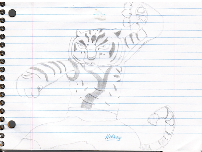
September started great and then fizzled, due to a number of factors.  I'm not here to make excuses, though: I'm here to celebrate achievements.  It's now been half a year since I took up drawing.  Incredible.  It feels like nothing.  I'm halfway to my goal.  Well, my original goal was to draw everyday for a year, and I've slipped up several times.  Still, one year.  Almost there.  Let's look at my favourites from the last month:


I'm somewhat saddened when I realize I drew two of these images in one week, and the last one took two weeks.  I get less sad when I realize how awesome these three are.  Master Tigress looks great, I can barely believe I made this Auron, and Wolf-Link shows what patience, hardwork and a new 2B pencil can achieve.

The coming two months will test my resolve, as I get very busy from here on in ... though I think I say that every month.  My quest to be an artist will not stop, though.  I will keep going, I will persevere, and I will strive to make even greater improvements over the next six months.

Saturday, 29 September 2012

Week 26: The Wolf's Done At Least...


For three weeks now I've been stuck on one image, trying to get 'er done.  Slowly but surely, it's coming along.  I blame ... myself for the lack of progress.  Sometimes it's perfectionism, going over the same spot 20 times when just once was enough.  Sometimes it's only putting in a few minutes because I waste time doing other trivial things instead.  Oh well.  I promised I would finish the wolf, and that I did.  Have a look.


Wow.  It actually looks really good!  Again, ignore the wavy lines.  The new darks achieved with my 2B pencil really add a whole new layer to my drawing.  If nothing else, it allows for awesome contrast.  The eye is the only white on the whole page: everything else is a shade of grey, and I used my erasure to make sure the white was as white as possible.  I think it makes a marvellous effect.

The image looks better on the page.  For one thing, there's more contrast between the top of the head and the background.  For another, the fur stands out more as fur.  The black oval section just SW of the eye looks odd here, but on the page it clearly looks like a fur pattern, not a cavity or recess in the face as it does here.

Here's the pic from last week, so we can compare the progress.


Making promises here seems to work, so I'll do it again: I promise I'll get the full picture done for next week.  Then we can move on not only from this, but soon from the perils of bad drawing paper.  

Sunday, 23 September 2012

Weeks 24 & 25: Two Weeks, One Half-Finished Piece

During these two weeks I had computer problems, a huge work load and sickness to deal with.  Seriously, I had so much mucus that it dripped down my face whenever I looked down.  This made drawing an unappealing activity.  Essentially, during these two weeks I only drew this, but it's not nothing, either.  Let's take a look.


This is a Zelda: Twilight Princess wallpaper, found here.  This is a fairly ambitious project, as it should be.  I have maybe two pages left in my notebook, and I want those pages to be awesome.  I'm not going to mail it in.  True, the paper is horrible, as we can again see here: the return of the wavy lines of doom.  You'll have to take my word that it's fully black there.

I spent about one hour just shading and blending the background.  I figured to just get that out of the way, and I can erase things for white highlights as needed.  That's proved smart so far.  I then sketched the basic outline of the wolf head.  From there, I've focused on the darkest darks and am slowly filling them in with my brand new 2B mechanical pencil.  I've been looking for one forever, and I found it at a Dollarama of all places.  Considering the usual quality of Dollarama products, it's amazing.

I'd wager the wolf is more than half done.  Shade in the rest of the dark, then add the lighter sections, plus the eyes and the ear.  That should easily be done for next week.  The real question will be whether I can finish Link on the opposite side.  That will be harder, but I'll certainly try.

Friday, 21 September 2012

No, I Didn't Die, But My Computer Did

My computer decided to explode on me, and then my modem spontaneously combusted, and then everyone I knew caught the bubonic plague.  If I'm exaggerating, it's only by a little.

But really, my Internet stopped working literally the day I planned on uploading my week's content.  I can now upload that retroactively.  Since then, I've spent the better part of my free time decoding my computer's issues, covering for sick colleagues at work or being sick myself.  That's a fancy way of saying I didn't draw much the past ten days, and even when I did, I didn't have Internet access to upload it.  Everything is more or less okay now, so my art journey resumes now.

Thanks for the patience.  On the plus side, with so much going wrong in such a short time, it should be clear sailing here on, right?  Based on probabilities, it's unlikely to be worse.

Sunday, 9 September 2012

Week 23: I'm Back!

They say absence makes the heart grow fonder.  It also evidently makes it more productive.  After taking a few artistic days off, coupled with a less intensive work schedule, I exploded artistic juices virtually every day.  If that metaphor wasn't graphic enough for you, take a look at these:


To start with, I finished off my Tigress from last time.  The shading turned out real well, and I fixed the nose/mouth area as best as I could.  Her body ended up looking a little stocky, though, which kinda irks me. Tigress shouldn't be wide.  Anyway, kudos to my shirt shading: getting the flowery images to turn out took a lot of patience.


THAT'S BETTER!  Not so wide anymore!  Okay, so I happened to watch Kung Fu Panda 2, and this scene has always stuck with me for some reason.  Actually, it was really hard to draw because, as a night scene, all the colours are muted, making it hard to separate them with just shades of grey.  I think I did alright in that regard.

Proportions are great, shading is fairly consistent, I made some attempts at shadows, heck, even the paper cooperated.  More than anything, I feel I captured the feel of this scene.  Tigress perhaps looks a little calmer, a little happier than normal, but that's okay.  When it comes to foreshortening, this is the standard I'll now have to hold myself to.  One of my new top five favourite drawings.  (Other people seem to think so too: it's currently my most favourited and commented section on DA.)


This is Auron, perhaps my favourite character from one of my favourite games, Final Fantasy X.  I don't play games much anymore, but I still play FFX every year or so.  I won't lie, this is my second favourite drawing, just missing out on Mr Lion.  Maybe if I did the hair better.  I don't like anime-style hair, but I wanted to keep his hairstyle, so I did a mixture of realism and anime.  Didn't turn out too bad, but I'll need more practice to really make it work.


This is the first realistic cat I've tried to draw in a long time, depending if you want to count Mr Lion or not. It didn't turn out super-great, but it still has potential. The problem I had was the very long fur, which disguises the contours of the face. It was hard to tell where the face ended, or even where the mouth begins and ends. In fact, that mouth took ages to get, and I never fully got it. If I want to draw cats, and I do, I'll have to study that mouth region more.

I know I said I would take a break from trying realistic images, but, well, it's too much fun.


Now here's a pair of simple images. The one is sort of a tattoo, while the other is pure cartoon. Both got cut off by my incredible page-planning skills. The sleeping-cat like thing I'm not terribly happy with. I figured after all the difficult images I drew this week, this should be easy. It wasn't. I've noticed I have a hard time with curved lines, particularly S-curves. That is, I can free-hand a straight line fairly accurately compared to my reference, but curves end up going way off track, and I need to redo them over and over. This is interesting, because in high school mathematics I was very good at eye-balling angles without a protractor. Then again, most angles are formed from straight lines ...

Anyway, the other image turned out much better. She has an almost saucy expression, the quintessential spoiled feline princess. I didn't have room to finish the body, but the head was always the main draw. I drew it and I'm happy. Proof that I can draw simple pictures!


Finally, over at DA, Naftalina25 drew a picture for me. For me! How incredibly sweet. HERE it is. I mentioned that Espeon and Articuno were among my favourite Pokemon. Yes, I liked Pokemon. We all did as children. Still think it was one of the greatest concepts for a game ever; too bad Nintendo has dropped the ball on MMORPG.

Anyway, after receiving this gift, I thought I'd draw my own version. First we have Cuno in my favourite pose (which took an eternity to find online; the standard poses seem far less dynamic to me). I remember, years ago, tracing this exact picture back in Grade 7. It would be neat to find that old drawing and compare it to what I have now. I had a rough time with this because I switched reference images halfway through, since I found a clearer image. Though the proportions aren't exact, the front talon looks kinda foreshortened, which I'll gladly take.

Espeon I'm less happy with, as again a relatively simple image has let me down. I couldn't draw its back for the life of me (you can see the many erasure marks). Oh well. The overall pose, to me at least, resembles a cat, especially when you factor in the eyes. Most people assume the whole Eevee group to be canines, but I'm not so sure, at least with Espy.

Someday I should draw my original six team, all in battle poses. I'll save that for later, though.


So, I'd wager those few days off last week really helped. I drew more pictures, and with much better quality, that I did through most of the summer. Actually, I may have put in more time in these seven days than the whole summer. That tells you something ... well, mostly that I had time off from work, but I choose to spend that time drawing as opposed to, say, sleeping, or watching TV.

I almost certainly won't be able to keep this pace up [editor's note: I didn't], but I will try. Onwards and upwards.


Wednesday, 29 August 2012

There Will Be No Week 22

I'm making an executive decision here.  I'm going to stop drawing this week.

There's lots of reasons.  One, I'm really tired and cranky.  That's not conducive to creativity.  Next week summer is over and my schedule goes back to not being completely ridiculous.  That will help.  Two, insomnia has bitten me real bad ... making me tired and cranky.  I guess this is just an extension of the first point.  Three, I just have no motivation.  I come home and I want to lie down.  My body is starting to run down.  Heck, I'm even skipping some of my fitness workouts.  That's the surest sign I'm burning the candle on both ends a bit too much.  You have to listen to your body, because you're the only one who can.

So I'm taking a break, from everything.  Good timing, I think.  It's a long weekend coming up, and then it's a new month and everything starts fresh.  I'll be raring to go, and maybe I'll put an hour in each day to make up for some of this lost time.

See you next week.

Sunday, 26 August 2012

Week 21: The Rest of the Furious Five ... Mostly

Unfortunately, I didn't have a lot of drawing time on my hands this week.  In fact, I've actually worked 13 days in a row, most nearing 10 hours.  I go home and go to sleep.  Except sometimes I've had insomnia, like the past two days, in which my days become less fun.  So, really, my not drawing a lot makes sense.  Still, let's take a look.


This is Master Monkey.  True story: I spent three months trying to learn monkey-style kung fu at university.  My instructor thought it would be the best to complement my natural abilities.  Those three months sucked, and at the end, the instructor conceded that I'm not a good monkey.  That experience likely helps shape why I don't like Master Monkey.  As for the picture ... meh.  It does nothing for me.  It mostly looks Monkey, I guess.  Some of the hands are okay, others are horrible.  I won't be drawing Monkey again anytime soon.


This is (mostly) Master Tigress.  No, it's not completely finished yet, but I'm uploading it anyway.  True story: my Kung Fu instructor said "You're a natural tiger."  Later, as I finished my training with him, he said "You'll be a tiger for life."  This thrilled me.  Tigers and big cats have always been my favourite animals.  Relatedly, Tigress is my favourite of the Furious Five.  This drawing is shaping up fairly well ... except for the head.  The head doesn't capture the tilted 3/4 perspective.  I blame the jaw and nose.  Something is off there.  I will erase and redo that area, hoping to fix that area.  The marking are fairly good.  Obviously, I still need to shade virtually everything.  Let's look at this again when I finish it.


For me, summer ends next week.  Then I go back to regular working hours, which means more art hours.  I look forward to it.

Thursday, 23 August 2012

My Average Summer Day

Summer is a great time.  I try not to complain about summer: not the heat, or the lack of rain, or the then abundance of rain.  Summer is meant to be enjoyed.  That said, summer has a tendency to work people to the bone.  If you climb into bed on a summer night not completely exhausted, you're doing something wrong. Between summer jobs, swimming, playing outside, or even just baking under the sun, you shouldn't have excess energy at day's end.  For me, this is doubly true.

Here's my average day.  Note the word 'average.'  By definition, some days are better and some are worse.

7:00am: Wake up
7:02: Start my morning yoga/martial arts stretching routine.  Goal is to reach the splits by start of 2013.
8:00: Have a shower and prepare breakfast.  Pack a lunch.
9:00: Twenty minutes of meditation.
9:20 - 10:30: Free time.  For this blog's purpose, this is the time where 90% of my drawing gets done.  If I don't draw now, I might not get a chance later.
10:30: Get ready and leave for work.
10:50am - 3:00pm: Working at a summer sport's camp run by the karate school I go to.  My job description basically reads 'keep kids aged 6-10 happy and entertained.'  I like kids, I really do, but this is an exhausting four hours, especially when I'm the head councillor for the day.
3:00 - 3:30: Down time.  I would call it free time, but I more or less use this time to sit in a silent corner and take deep breaths, unwinding.  I have yet to do anything productive in this window, save for perhaps dropping off library books.

My schedule now diverges, depending on whether I work that afternoon.  If yes, which is the majority, then:

4:00 - 9:00: Working as an assistant karate instructor.  As far as summer jobs go, this is awesome, but it has more physical demands than, say, operating the McDonald's drive-thru.
9:20: Arrive home, eat something, go to bed shortly.  If I still feel alert, I might draw.  I think it's happened maybe twice.

And when I don't work:

4:00: Go for a 5k run.
4:30 - 5:30: Free time.  Good time for drawing.
6:00 - 9:00: Personal karate training.  The number seems big, but I spend about half the time teaching and correcting other students.
9:20: Arrive home, eat something, go to bed shortly.  If I still feel alert -- no, hasn't happened.

Looking at this, this is a hefty schedule.  I often work nine hour days, not to mention my own personal fitness goals.  On most days I have maybe two hours of free time, but it's not as if I use all that time for art.  I have other interests, from simple reading to juggling to being with friends and family, not to mention the pure laziness of relaxing to the TV or a videogame.  Also, necessities like cleaning or shopping or doing dishes or petting a cat get priority.

The fact I draw at all is impressive.  I'm making some big sacrifices to fulfil this art challenge.  I've effectively given up chess, writing and music in favour of art.  If this doesn't show dedication, nothing does.  One reason I'm not super-psyched about art over the last few weeks is likely this schedule.  If I can survive this, I can survive any art-related challenge.  When I'm an accomplished artist, I can look back to this time and know my dedication here brought me my future results.  No question.

Sunday, 19 August 2012

Week 20: The Furious Five, Three at a Time

I love watching cartoons, and by that I mean real cartoons, not the animated dramas called anime.  Children's cartoons focus on fun, and most have surprising depth.  Look no further than classic Disney, in particular from about 1973-1995.  These movies are characterized by fun, active characters in simple yet engaging plots, and almost always accompanied by a strong moral message.  Though Lion King is unquestionably my favourite, I'd like to give a shout out to Oliver & Company, a criminally underrated film.

I also love martial arts.  I've been practicing various forms for about half my life, ranging from tough tournament competitions to the daily quest of self-improvement and mastery.  It's undoubtedly the best thing I've ever done for myself, though learning to draw may become a close second.

Given these two paragraphs, it should be no surprise that I love Dreamwork's Kung Fu Panda.  It's a simple, fun frolic in the world of animation and martial arts.  When I first watched it, I actually redoubled my own training, such was the effect it had on me.  This week, I tried to draw some of the characters, starting with the Furious Five.  I hoped to do all five in one week, but ... here's the first three!


This is Master Viper.  True story: one of my sparring stances is modelled after Snake Kung Fu.  Many of my partners say it's very tough to spar against, and I've had great success with it, even if my own Kung Fu experience is rather limited.  This is probably why I'm drawn to Viper.  I'm pretty happy with this drawing: the scales on her belly look good, and the pattern around her back turned out well.  Ignore the dark cloud near her head: that's completely the scanner's fault.  For a line art of a snake, I can't do much better than this without investing double the time.  Awesome.

This is Master Crane.  True story: I studied Matsumura White Crane style for two weeks, before I left for university.  My sensei then past away before I returned, much to my shock and horror.  I've sometimes wondered if going to school was the right choice.  This doubt likely fuels my interest in Crane ... as well as his sarcastic wit.  I'm less happy with this one: it definitely looks like a bird, but it doesn't immediately looks like Crane.  I need more detail in his face, hat, eyes, feathers and talons .... in short, everywhere, but again, I was in a serious time crunch, so this will have to do for now.


This is Master Mantins.  True Story: I have no experience with mantis kung fu.  Sorry, no more personal anecdotes.  I do like praying mantises in general, though, and Mantis is a mantis.  This drawing took about an hour, making it the quickest of the three.  I managed this in part by ignored the shadows.  There's nothing glaringly wrong with this image, but I don't really like it.  Oh well.

Here's all three on the page:


For the record, I had two days this week where I worked more than 12 hours.  I'm used to busy schedules, but even that's a little too extreme for me.  Thank the Goddess I had drawing to fall back on: just a few minutes each day to sit at my desk and be creative, not reactive or productive.  One day I'd try to get the outline, the next day I'd go for the quick shading and details.  Not a perfect system, but when you are starved for time it's better than nothing.

Next week I should finish the rest of the Furious Five ... and hopefully more, and seven days to do two characters seems excessive.  Or maybe they'll just have seven days worth of detail and finish.  You'll just have to wait and see!  Oh, surprises!

Sunday, 12 August 2012

Week 19: Back to Basics

I've decided to really focus on line art for the rest of this month.  There's a couple of reasons.  One, when I do my realistic stuff, about 20% of my time is sketching the outline and the rest is varying degrees of shading techniques.  That's not an ideal ratio.  I feel like my outlines are often weak, and I need the good shading to 'salvage' the drawing.  Finally, I only have 10 pages left of my notebook, and I can fill it up faster if I don't focus on expertly shading every little thing.  That's the goal, at least.

First things first, my second birthday card:


This is based off my sister's favourite game, Robot Unicorn Attack.  If you've played it, it's probably your favourite, too.  If not, go play it here.  See you in a couple hours.

I drew this in two and a half sittings.  As is, it looks okay, but I wanted to do so much more.  I simply ran out of time.  In fact, I didn't even turn it into a full card; I just wrote a happy birthday message in the top corner and called it a birthday poster.  She loved it, by the way.

The drawing is good enough.  I was happy to give it away.  The one butterfly-sprite thing looks quite good.  Considering I rushed, the dark, even shading of the unicorn is quite impressive, even if the transition to the lighter colour looks artificial.  The circle I drew completely free hand, and it looks very round.  Awesome.  Finally, we have the lettering.  About 70% of the letters looks okay, but several are off in some way or another.  I realized too late I should have used a ruler to make it all level, or even some guidelines.  Oh well.  Considering I'm trying to copy a computer font in block letters, I'll take it.


This is a simple line drawing of Amaterasu, a character from the super-awesome game Okami.  I actually copied the design from somewhere online, but I forgot to record where.  Opps.  If I find it again, I'll be sure to properly cite the source.

So ... it's a howling wolf.  Not the first time I've drawn something like this.  Not bad.  The head/snout area is off in some way, and considering that's the most important part, that negatively affects the whole.  This only took ten minutes, so as a quick and simple drawing, that's a good sign.  A few months ago it would have taken me three times as long to create a worse image.  Progress.


Here we have my sunglasses.  They are a dark pair, with dark lenses, drawn in a dark room.  Again, a fairly fast sketch, as I wasn't in a great drawing mood that day.  I tried shade in the non-lens part quickly but still conveying the shadows and contours.  Again, not bad.  I didn't realize how complex this project would be, because there are a lot of weird little angles, most of which I glossed over.  Also, the reflection in the lens would have taken a solid week to try and draw.  So I didn't.  Note to self: when I get really good, try to do a piece conveying reflections in someone's glasses.  It has the potential to be awesome.


Finally we have this failure.  It's an unfinished rose.  It sucks.  The centre few petals are okay-ish, but I had such negative thoughts about this one almost from the first stroke.  I tried and tried and tried to get the bigger, surrounding petals, but nothing worked.  In the end I just abandoned it.  I'm not a big flower guy, anyway.


I suppose there's no point in hiding it: this wasn't a great week, and this is about ten days now of me feeling utter hostility towards drawing.  It takes an effort of will to sit down and actually put pencil to paper.  To be honest, though, I expected this.  When most people try something new, such as a commitment to get into shape, they quite after two weeks.  If they survive that, the next hurdle is just after month three.  For some reason, the enthusiasm just seems to plummet around then.  I've seen it time and time again.  If you fight through this plateau, the rest is smooth sailing ... until the next plateau.

That's why I'm going to keep it simple and do some line drawing.  I'll beat this by sheer quantity if I have to.  I'll just draw my favourite characters from my favourite movies or games, I think, something fun.  Let's see how it works next week.

Sunday, 5 August 2012

Week 18: A Birthday Card

Back to drawing this week!  Yeah!

My family has two birthdays coming up, for my brother and sister respectively.  Well, technically, my brother's birthday was last month, but he's away from home and won't return until mid-August, so we'll be celebrating both in the coming weeks.  For the first time ever, I decided to make my own birthday cards.  It adds a personal touch and I save a few bucks ... though, assuming I got paid minimum wage, this first card would have cost over $30.

I'll just add here that making art for someone else, even just a carefree birthday card, is rather stressful.  I became far more critical of my work, something I didn't think possible, but there it is.  You always want to make it perfect, but when someone else's eyes will be seeing it, you want to make it extra perfect.  Though I only made one birthday card, essentially two images this week, I put in many hours of work.  Here we go:


This is the front cover (the card is folded in landscape style, so it's longer horizontally than vertically).  For those who don't know, this is the Pokemon Krabby.  I think I did an excellent job with this: good proportions, nice shading, looks like the real thing.  Note that my scanner wasn't being my friend today, and it refused to scan the top part of this image, which should read "Don't Be."  In other words, the front of the card says "Don't Be [picture of Krabby]"  Why don't be crabby?  Because ->


Don't be crabby, it's your birthday!  So, basically, you open the folded card up, which reveals a much happier crab, complete with party hat, party balloon and a present, as well as a banner.  I won't lie, drawing this part really sucked.  Krabby doesn't have as nice proportions, and trying to turn the claw sideways to hold the present almost made me scream.  Not to mention the completely 2-d present looks completely out of whack with the rest of the image.  But hey, at least the balloon looks good!  I think it's the best touch.

I believe this is my first sample of handwriting uploaded here.  I have excellent handwriting, but it isn't very artistic: it's small, compact and straight.  I'm told it looks like a computer font.  I write to take up the least amount of space possible, so I can cram more words onto a page.  This is an admirable trait but less good for a birthday card.  It takes an incredible act of will to write bigger, and still, the first time I wrote 'birthday' it covered maybe 1/3 of the banner.  I tried it three more times ... then I practiced writing it on a separate piece of paper about six or seven times, and then I finally did it.  Even here, I had to add the exclamation mark to make it even, but it worked.

Here's the complete card in one image:

Of course, I've added my own little message in the black space under the banner, but the Internet doesn't need to see that.  This is my art blog.  You're here for my art, not my sappy birthday banter.

So, this is the first time since grade school that I made a birthday card, or even just a card in general.  I never remembered it being this stressful, the desire to make everything perfect.  I think it came out rather well.  It might not be funny, but it's definitely light-hearted, and that's always fun.  Also, my brother doesn't know I've been practicing art, so I'm sure he'll be impressed by that alone.

I now have to make one more card.  Her birthday is Thursday, but I don't really know what I want to do.  I know the general theme of what I want to do, but not any particulars.  I have four days, so I better think fast!    This is my first artistic time-crush.  Let's see how I fare.

Tuesday, 31 July 2012

Month Four Complete

This should be a happy moment, four months of (almost) continual drawing.  Unfortunately, the memory of last week's failure still resonates loudly within me.  This is the first time I haven't included an exclamation mark in my month-end serenade.  Still, one indiscretion should not mar an otherwise excellent month.  I produced relatively few images, but almost all were Hall of Fame worthy.  It doesn't even make sense to compare my work this month to anything previous; the difference is just too great.

Here are my three favourite creations of the last four three weeks.


My Master of the Skies.  Someday, I'll redo this with quality paper and frame it the way it deserves.

Is this the best thing I've ever drawn?  Possibly.  Is it my favourite?  By the Goddess, yes!

This image grows on me the more I look at it -- which is often, as  I have yet to turn the page to start something new.  It's a reminder of a happier age, an age that knew not failure, an age to which I will return.
Four months.  That's 33.3% of a year.  That's over 100 days.  Assuming 20min a day, a figure I have routinely triple, that's 40hours of time invested.  Worth every minute.  Drawing, like all acts of creation, is a joy, so much so that not drawing has affected my emotional stability (I exaggerate, but only a little).  I said I would draw for a year and then take stock of my progress, to see if I should continue.  That provision is no longer necessary.  I can't imagine a future in which I don't keep drawing.  I'm a convert for life.

Sunday, 29 July 2012

Week 17: Disappointment, Unhappy, Failure

There's no way to sugar-coat this: I didn't draw this week.  I have some good reasons, but they are ultimately just excuses.  Anyone can find 20min a day.  As is, I drew regularly for two days, did five minutes the third and absolutely nothing the rest of the week.  I apologize, especially to myself.  I let myself down.  I am sorry.

I have decided not to upload my limited results, as nothing was finished.

I have very high standards for myself, and when I do not meet them I become understandably disappointed.  Good will come of this, however: I will redouble my efforts and strive to make next week the best week ever.  I'll wake up an hour earlier if that is what it takes.  Whatever the cost, I will pay it.

I apologize once more.  See you next week, with some amazing art in tow.

Sunday, 22 July 2012

Week 16: Going Tribal


I was busy this week. As I mentioned last post, I put my realism practice on hold for the time being, at least until I get better paper. Instead, I returned to tribal art. I made my first tribal image about two months ago, and I really enjoyed the dynamism the random shapes seemed to convey. This week I focused exclusively on this style of art, with fairly decent results, I think. Let's take a look.


At the top we have two attempts at a howling wolf, taken from this tutorial.  I drew the first one completely to the suggested instructions, and it turned out fairly sad.  I knew I could do better, so that very day I went back and tried again, this time ignoring the step-by-step.  The result was much improved, so much that I completely ignored the instructions for every other tutorial, all sketching freehand.  

The middle image is a rather strange cat, something that could be a highschool sports logo.  I'm not a huge fan of this image, either mine or the original I copied, but it was a quick drawing on a day I had little time, so I'll take it.

The final image is a full bodied wolf, an incredible image.  I'm quite proud of this one, because the source was a sped-up video, and I could only reasonable freeze the final frames and try from there.  The result is excellent.  I could improve the ear area, and I could size my drawings so they don't always leak off the page, but this remains my favourite drawing this week.


Here's a dragon.  You'll notice the bad paper here again, as my shading looks awful.  Good choice to not try to do realism drawings!  I quite like this drawing, even if it perhaps the simplest.  The head is quite detailed, and the wings are strong and vibrant.  Also, I didn't like the way he positioned the tail, so I created my own interpretation, a sort of stegosaurus-spiked version.  Not bad, but nothing special.  I'll take it.


Here's a better dragon.  Oh yes, this one worked out well.  This was the first image that took more than one day to complete; the many little wisps of curly line demanded too much patience for me to finish.  With the exception of the claw, which looks sad, I nailed this one.  Perhaps the white spaces inside the dark body could be bigger, but again, I'll take it.


Getting more and more complicated, we now have a leopard or some other medium-sized cat.  On the one hand, I made the body too fat.  On the other hand, I really like the face, with the suggestion of whiskers.  The interplay of shapes within the body was also fun and worked well, or would have had the body not been too large.  Probably my weakest attempt this week.


Finally, I drew a tribal horse.  Funny: as I was drawing this, I thought it sucked.  When I finished it, my thoughts did not improve.  But as I look at it now, it seems quite good.  The mane got cut off by the page again, but not by much, and not enough to really spoil the effect.  The one ear looks almost like a horn, but I have no problem with a unicorn instead.


I used an unprecedented five pages this week.  I only have 14 or so pages remaining in my notebook, and then I can trade it in for some decent art paper, a real sketch book.  For this reason I'll likely continue with line and figure drawing, ignoring shading for now.  I think line drawing is a big weakness currently: a number of my realistic drawings looked horrible without the hours of shading I invested.  If I can get my starting line art to be stronger, it will improve everything.  As for tribal art?  I like it, a lot, but I think I'll wait until I get some more experience before I invent my own.  Who knows what next week's theme will be, but I'm sure it will be fun!

Thursday, 19 July 2012

It's Official

I've just done something I never thought I'd do.  Well, that's an exaggeration: I knew I would do it someday, but I was expecting it months and months, maybe even years, from now.  This might be one of those areas where low expectations are best, for you can then exceed them so much quicker.  Anyway, what is the glorious thing of which I speak?

I'm officially an artist.

Let me explain: my sister invited her friend over to the house, and for some reason they found there way near me and spied my latest creation, Mr Lion.  My sister's friend was very impressed.  "Wow, you drew that?"  Yes.  "That's really good.  That's really, really good."  Turning toward my sister, she says, "I never knew your brother was an artist."

Me.  An artist.  Really good.  An artist.  An ARTIST!!

I have never used that word for myself.  Search this blog, you won't find it.  I'm a trainee, developing a skill.  I do art, I practice art, but I'm not an artist yet.  Now, I'm a trained philosopher, she's a 12-year-old girl.  I probably stress exact meaning and definitions with my words more than she does.  Still, not once in my life has anyone called me an artist.  This is literally a first.

How did I celebrate?  When I came down from my joyous state, I headed over to my account on deviantart.  I'm not sure why I'm linking it, as 98% of my audience comes form there... Anyway, I went there, loaded my profile and checked the box asking 'Are you an artist?'  Boom, just like that, I consider myself an artist.

Perhaps this means nothing to you.  Again, most of the world uses words rather haphazardly.  There are people who throw paint at the sides of buildings and call themselves artists.  For most people, it's not a big deal.  For me, it's a cosmic paradigm shift.  At least one person has seen my lines on paper and deemed me worthy of the title 'artist'.  I'm no longer an outside trying to break into a creative realm.  I've been admitted into the club, so to speak.  I am an artist.

As a comparison, think back to the first time in public school called you cool (or awesome or radical or whatever the buzzword happened to be).  Do you remember that incredible feeling of acceptance, of things finally going your way?  I feel like that, only better, and bigger.  It's as if a whole medium has accepted me.  "Okay, JoeZoo, you've paid your dues.  Welcome aboard."

Confidence is everything, and my confidence has never been higher than when a young girl I don't even know said something she may not even remember.  I can't wait to see what I produce now.  Never underestimate the power of a kind word.

Saturday, 14 July 2012

Week 15: RAWR!!1

First off, disclaimer: my summer hours at work have soared.  This is a good thing, I guess, in general, though it really cuts into my drawing time.  I've been averaging nearly an hour per day over the last little while, and not being able to do that hurts.  We may have to expect less quantity in each installment.

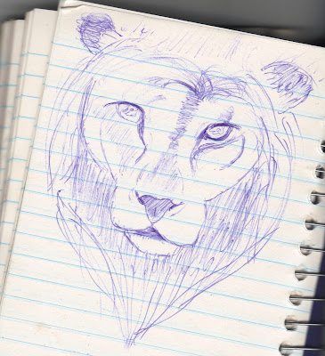
Case in point, I drew only one image this week.  It's sorta-but-not-really from Lee Hammond's 'Big Book of Drawing' again.  She has the picture there, but she gives no directions on how to draw it.  None.  Worse, I don't even have the book: I returned it to the library.  I drew a quick sketch and an even quicker outline and then spent the rest of the week trying to turn this into a finished product.  I'm quite pleased with the end result, all things considered.  Here's the sketch:


I quite like this, to be honest.  I try to sketch in pen, as it largely overcomes my obsession with erasing my very first few lines because they aren't 'perfect.'  It's clearly a lion, the form is easily recognizable, the face has depth and character.  For less than five minutes of sketching, I call that a winner.  Now let's see what I turned this sketch into:


Again, standard disclaimer: ignore the wavy lines from the crappy paper, except where the wavy lines look good.  Then don't ignore them.

There are lots of little things wrong with this picture, from proportion (the mane is far too big, the ears are too close and in the wrong spot) to tonal values (the right eye is darker than the left, while the right ear is lighter than the left) to overall composition size (the mane shouldn't be half hidden in page-less land) to a whole bunch of little areas.  And yet none of that matters.  I love the final product.

(Actually, I really should have taken a scan half-way through drawing this, before I added the mane.  It's amazing how young and feminine the face looked, and equally amazing how just adding a few hints of hair turns it into a dominating, powerful male.)

I spent four days doing the face and finished the whole mane in one sitting.  Yes, I rushed that part a bit, but it still looks good.  My favourite part is the area around the nose (though it could be darker) and my least favourite is the mouth and cheeks.  I don't know why, because I think the highlights are cool and the lower mouth has awesome fur shading, but something is off.  I never bothered to add whiskers, which I think suits the image fine.

My hair work is getting better.  At least on top.  The layers, the highlights, the contrast from light to dark, I think it's the best overall job I've done yet.  I love it.  I love the whole thing, warts and all.  Maybe it's because it's my first cat in over month.  Maybe because it's my best cat ever.  Mighty lion, you have a special place in my heart.


And with that, I think I should take a break from my realism practice.  I'm worried I'm spending too much time shading and not enough time drawing form and outlines.  This is actually an interesting question: is it better to spend five days working on one big project or on five smaller ones?  Which is better for my art development?  I don't know, but then, I'm not complaining about my results so far!

Saturday, 7 July 2012

Week Fourteen: 'BBoD' V, Now with Animals!

Like I promised, this week I focused on drawing animals, once again from Lee Hammond's 'Big Book of Drawing'.  The book is due back at the library on Monday, so this will be my last week with it.  Just as well, since I've pretty much exhausted her pencil-drawing section (the rest of the book deals with pencil crayons, which looks an amazing amount of fun; alas, I have no pencil crayons, and I'm not sure if the $4.99 brand sold at Wal-Mart would work for her realistic technique.  Oh well).

Also, she has about eight images of horses, four dogs, but only one cat!?  And it's not even a very good cat. That's enough to stop using the book right there.

Anyway, here's the results for the first week of July:


First we have a seal.  It looks fairly impressive, but when you break it down it's pretty easy to draw.  It's essentially a long tube, curved around the head, with an eye, nose and whiskers.  The rest is just gradient shading.  I'm really happy with the result... but is it just me, or does the facial structure faintly resemble a dog?  I keep seeing a dog out of the corner of my eye.  Weird.

Then there's the squirrel.  Here's a funny case where the scan both looks better and worse.  You'll have to take my word on this, but the tail looks really puffy and tail-like on the page.  The scan makes it more like porcupine needles.  However, it also makes the fur much better.  Like, holy crap, it looks furry.  It looks furry on the page, too, but not this good-looking.  I'll take it.  Note that I drew this squirrel in virtually one sitting, just under two hours.  I was really focused that day.

Moving on, we have this:


Pretty big step down in quality, amirite?  I spent over half an hour trying to get this falcon's (yes, it's supposed to be a falcon) head right, but it kept looking off.  I had erased and redrawn this section of paper so much I was worried I would tear a hole.  So, basically, I just roughly sketched the rest of the upper torso, roughly shaded it in and vowed to try again the next day.  And I did.  It took five days, but behold, my master of the skies.


Alternatively, this could titled, "Why You Should Use Quality Paper for Drawing."  So far, I have used a spiral-bound notebook for all my drawings.  I have about ten left over from my school days, and I figured it was a cheap and easy way to keep all my drawings together, rather than fumbling with a binder for instance. I was right, but the emphasis was really on 'cheap.'

When you look at the page, you don't see 95% of those wavy lines.  There is some distortion around the black wing tips, which sucks.  Mostly, the paper scans like crap now, and where you see the wavy streaks it is very hard to properly shade.  The page's curve seems to resist the pencil.  This is incredibly frustrating, as an otherwise fantastic drawing, covering roughly five days, was effectively ruined before it even began, all because of the paper.  Well, not ruined; it looks damn good hanging on my wall.

My notebook is nearly full, so I think I'll keep going and fill it up.  My goal was always to have a series of books that I could flip through to see my progress.  Now I'll just be sure to fork out some money and get a quality artistic sketch book.  I tried fiddling with my scanner's settings in an attempt to make the picture look better, and I came up with this:


 This is much darker but less wavy.  The dark actually looks real good, but it took a small eternity to shade my bird a darkish grey, mostly because of the paper.  Anyway, enough complaining, let's praise the drawing!

The bird looks excellent.  After my rough sketch, I was able to get the head and beak area fairly decent.  The head doesn't completely line up with the neck/body, but it's still quite good.  I'm very pleased with the body; I think this is my best use of the eraser for pulling out highlights so far.  I like both wings, though for different reasons.  The cut-off one has a nice interplay of light and dark, and I think I pulled it off very well.  The other wing I like solely because I spent three days creating it, pouring in the details, and each day it looked better and better.  The wavy lines here really spoil the shading I tried to achieve.

My shading skill continues to improve.  The tones blend closer into each other, leaving less suddenly lighter/darker areas.  The seal may be the best example so far, but the whole right wing is darn good, too.


And with that, I finish with 'The Big Book of Drawing'.  I spent five weeks going through it, and these have undoubtedly been the best five weeks of my short artistic life.  I don't know what I will draw next.  My library has another book by Hammond, mostly on drawing full human figures, but I'm still in an animal-mood.  I might just give my realism a break and work on cartoons again; I haven't done any in a while, and they have the added benefit of taking less time, in general.  Hmm, you'll just have to wait until next week to find out!

Thanks once more, BBoD!  You'll always have a special place in my artistic history!

Saturday, 30 June 2012

Month Three Complete!

Another month completed!  Incredible.  This artistic journey has lasted nearly 100 days, which is about 95 days more than I thought possibly.  We're starting to see improvement, and big improvement in some areas.  I sometimes feel there's an artist hiding somewhere inside me, as opposed to before, where I thought I didn't have an artistic bone in my body.

Normally here is where I compare something I drew previously to a recent example to highlight said improvement.  However, because I spent all month working on faces, and my previous work was rather laughable, I thought I'd do something different.  Here are all my sketches.  Yes, all of them.  No, I don't do this a lot.  Nothing is dated, but you can still see noticeable improvement, even in these 30sec to two-minute doodles. 

Here are my earliest sketches.  I know the resolution sucks, but so do most of these doodles, so it evens out.  If you are unsure what a particular image is supposed to be, don't ask, because I probably don't know either.
Time frame: roughly the first five weeks.

Sketches are getting better.  At the top we have hands that look fairly hand-like, especially for sketches.  We also have what may be my best Joey ever, done in a fraction of the time.  (There's also a tiger, which shows that I haven't magically become a master sketcher yet!)  At the bottom we have four quick attempts at a beautiful cougar face, which also happens to double as my computer wallpaper.  Spoiler alert: expect to see a full drawing of this soon.

This is what inspired me to do this sketch comparison.  On the left, a cartoon with guidelines still visible, trying to get a face in the right proportions.  On the right, another sketch, this one from 'Amazing Faces' and is no better or worse than anything else I tried from that book.  In the centre, something I drew in two minutes yesterday night.  I find it very compelling: it's a very old face, or the rough pen lines certainly suggest this.  Drawn with value tones even though I'm using pen.  The cheeks are actually contoured, and you can tell where the face ends even without an outline.  The proportions are spot on even without guidelines.  Holy crap, what an improvement in sketching!

If you look closer at some of these, you might go blind, so I don't recommend it.  If you don't heed that warning, you may recognize some of my finished drawings.  In virtually every case, I did the finished drawing first, liked it, and then tried to see if I could sketch a likeness of it.  I think that's called working backwards.  Oh well, let's admire the improvement, and let's also bask in the glory of my proudest achievements again this month!


Unsurprisingly, all of my portraits made it into the Hall of Fame.  If I keep making works like these, I might have to become more selective... but that's not the hardest of problems, is it?  This draw everyday challenge has been marvellous.  I look forward to it everyday.  The improvements were so fast, so rapid, so unexpected, I feel like I'm living in a dream.  Let's see where this dream takes me in the next few months!

Friday, 29 June 2012

Week Thirteen: 'BBoD' IV, Presenting Mr Lincoln

I only drew one picture this week.  Does that make me a bad person?  Hardly.  I decided to do one more portrait from Hammond's 'Big Book of Drawing.'  Little did I know that it would eat away nearly ten hours of my life.  Were those hours wasted?  I'll let you be the judge.


I think I say this every week, but this is the best thing I've ever drawn.  Ever.  Do you know who this is?  He's a former President and, according to a movie, an even better vampire slayer.  It's Honest Abe Lincoln.  Or at least his head.  After ten hours, I wasn't about to start drawing his neck and shoulders.  I think it looks fine as is.

True story: this didn't look like Lincoln for the first five or so hours.  That got me scared.  I did the outline and the eyes, and it looked like a really young person.  I did the nose and the mouth, still a really young person.  Adding the beard made it a young person with an unusually scruffy beard.  I began to despair.  Maybe I really had wasted a week.  Then I lightly shaded his cheeks and Mr Lincoln suddenly appeared before me.

Talk about a eureka moment.

I could barely believe it.  The light, minimal shading around the cheeks turned this from a collection of facial features into a real, recognizable person.  It was so stunning, so instant, I didn't touch his cheeks again.  I tried to touch everything else up, but the cheeks I left alone.  This means his one nostril remained rather small, but I'll take it.

I'm so pleased with this I've uploaded it to my account on Deviant Art, which will basically serve as the Hall of Fame for my Hall of Fame, the best of the best.


And with that, good-bye portraits, see ya faces.  In a couple weeks I might try again, but not for awhile.  People are not my passion.  I want to draw animals, and dragons, and fantasy creations, and maybe landscapes ... people and portraits rank fairly low on the totem pole.  Nest week (more like all of next month), I'll get started on that.

Saturday, 23 June 2012

Week Twelve: 'BBoD' III, with lots of Hair

Another week of following Lee Hammond's advice in her book, "The Big Book of Drawing."  This week focused on several different hair-styles, much to my pleasure.  Drawing hair, and having it turn out well, is a real good feeling.  Let's take a look.


First we have a cool pony-tail.  This was my first and best attempt at hair.  It took a long time but never felt difficult.  Just lots and lots of lines, then drawing over those lines with more lines, and then 15-min later you have the one section done.  Highlights are getting better.  I drew a fairly good face as well, but my ear somehow ended up flipped the wrong way.  Weird.

The bottom hair-style is supposed to be wavy/curly, but it mostly looks like a mess.  I'll admit that I rushed this one.  Part of the reason is that Hammond's step-by-step approach starts slacking off at this point in the book.  Paraphrased: Step one, draw the outline.  Step two, do a bit of shading.  Step three, everything's magically done.  As is, you need to approach each wave as a small, separate entity, and when you complete them all everything will fall into place.  I lacked patience or something, and the rest is, um, I don't know what.  I do like the highlights at the top, though.  Yeah for some positives!


More hair!  This is perhaps my personal favourite, straight hair, the kind that flows in the wind so nicely.  It turned out okay, but I know what I did wrong.  The middle section, the anti-highlight as it were, doesn't curve in the same direction as the bottom-part, spoiling some of the effect.  I should have turned the paper around, allowing the natural curve of the wrist to flow in the proper direction.  Oh well, still decent.

The bottom one is your standard office haircut, I guess, parted off to one side.  Again, the instructions basically amounted to, "Draw an outline and let your innate artistic talent do the rest."  Notice that the ear is much better this time!  The left side feels a little flat.  The right side is better, though the front feels much thinner compared to her final output.  On the plus-side, I think my highlights are the best I've ever done.  I'll accept that.


Here's my portrait this week!  Can you guess who it is?  If you can, then I must have done a good job.  I'll give you a moment to look it over.  Here's a hint: it's George Washington.  I only finished this a few hours ago, so my thoughts won't likely be the most objective, but here goes.

It does mostly look like Mr Washington, though I don't know how or why.  This was a much harder drawing than the girl from last week, which kind of shows, but it was also a challenge I mostly met.  Eyes were hard again, but even though the one eye looks off in a slightly different direction I'm happy.  I actually really like the left one.  The nose, oddly, I struggled with the most.  I was never fully happy with it, but I had done too much of the rest of the face to alter it, and I didn't want to start completely over.  The face is a little too round and the chin is a little too short, but these are relatively minor.

Took three days, at about five hours total, give or take.  The clothing was a last minute decision, and I'm happy I drew it: only took about 15min, and it looks much better than just a floating head on paper.  Lastly, look at the bottom corner: I've updated my art signature.  It's now a JZ intertwined, with the 'roof' of the 'J' doubling as the 'roof' of the 'Z'.  I think it's clever.


This just about wraps up the portrait section of the 'Big Book of Drawing', which is good.  I'm thrilled at my progress, but faces every day for a month is starting to get a little dull.  I may or may not do one more portrait, and then it's onto animals!  Yeah!  Even if not, I'll just skip to the animal section.  I think this is the longest I've gone without drawing a cat, and that needs to be rectified.